Visualization and exploration of Spatial data in R
In this post we will base ourselves on the tutorial by Robin Lovelace et. Al. (2017) and the material that will be used is available here in the Creating-maps-in-R.Rproj project.
Initially, you need to install the following packages in the R:
"ggplot2", "ggmap","rgdal","rgeos","maptools","dplyr","tidyr","tmap"
The next step is to open the shape file. The shapefile is a file format that stores geospatial data, such as position, shape, and attributes, in a vector form. In RStudio you can open this type of file as follows:
library(rgdal)
lnd <-  readOGR(dsn = "data", layer = "london_sport")
head(lnd@data, n = 2)
sapply(lnd@data, class)
The last line of the code shows that the variable class Pop_2001 is classified as a factor, whereas it should be numeric. We must change it for this analysis:
lnd$Pop_2001 <-  as.numeric(as.character(lnd$Pop_2001))
sapply(lnd@data, class)
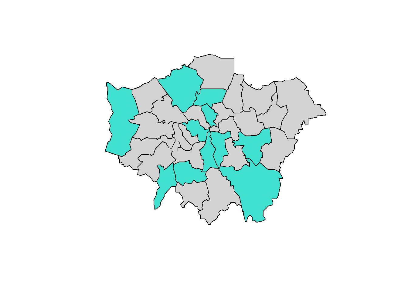
A first analysis can be made selecting the regions that have a certain index of participation in the sport:
sel <- lnd$Partic_Per > 20 & lnd$Partic_Per < 25
plot(lnd, col = "lightgrey")
plot(lnd[sel,], col = "turquoise", add = TRUE)
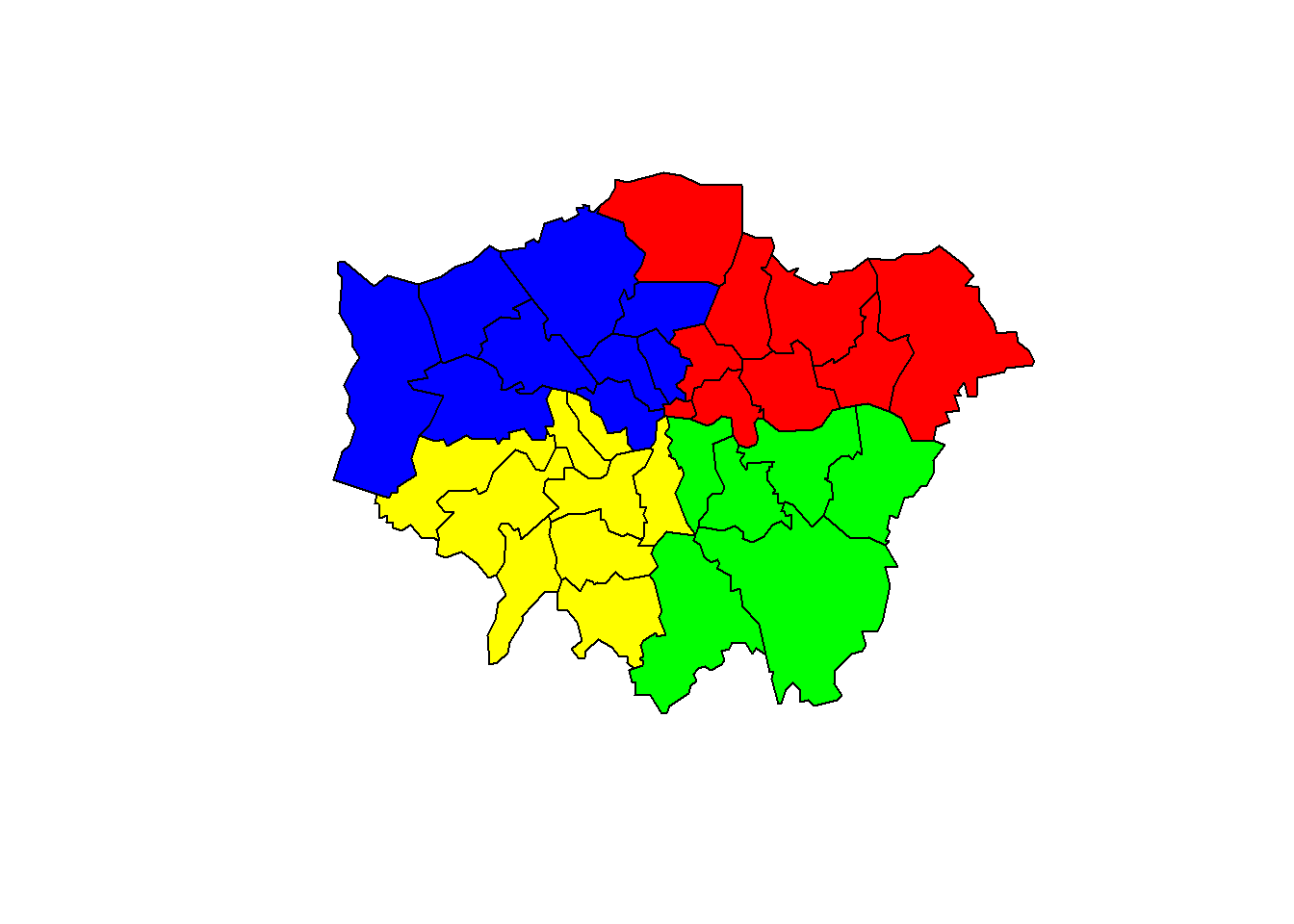
Another interesting analysis is the identification of quadrants. This division can be made based on the coordinates of the centroid, which in this case represents the central point of London.
library(rgeos)
## encontrando o centro da região de londres
lat <- coordinates(gCentroid(lnd))[[1]]
lng <- coordinates(gCentroid(lnd))[[2]]
## argumento para testar se a região está ao norte ou ao leste do centro
norte <-  sapply(coordinates(lnd)[,2], function(x) x > lng)
leste <- sapply(coordinates(lnd)[,1], function(x) x > lat)
oeste <- sapply(coordinates(lnd)[,1], function(x) x < lat)
sul <- sapply(coordinates(lnd)[,2], function(x) x < lng)
## testando se a coordenada está a norte ou leste do centro
lnd@data$quadrant[norte & leste] <- "nordeste"
lnd@data$quadrant[norte & oeste] <- "noroeste"
lnd@data$quadrant[sul & leste] <- "sudeste"
lnd@data$quadrant[sul & oeste] <- "sudoeste"

## colorindo os quadrantes no gráfico
sapply(lnd@data, class)
lnd@data$quadrant <- as.factor(as.character(lnd@data$quadrant))
sapply(lnd@data, class)
plot(lnd, col = "lightgrey")
plot(lnd[norte & leste,],col = "red", add = TRUE)
plot(lnd[norte & oeste,], col = "blue", add = TRUE)
plot(lnd[sul & leste,], col = "green", add = TRUE)
plot(lnd[sul & oeste,], col = "yellow", add = TRUE)
Creating maps whith tmap, ggplot and leaflet
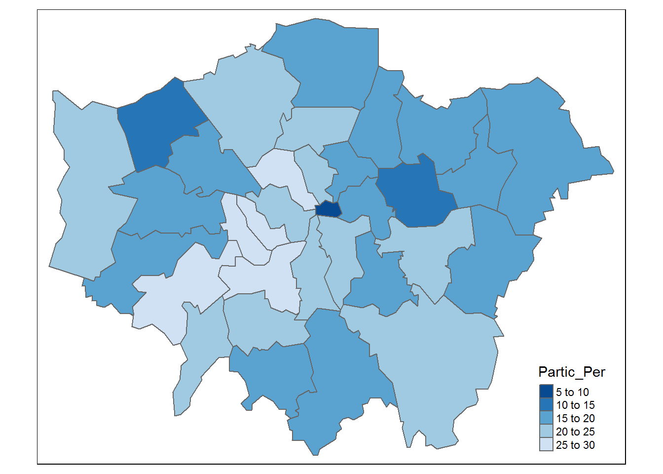
Tmap
The analysis can be done by generating a color gradient based on the percentage participation of the population in the sport:
library(tmap)
qtm(shp = lnd, fill = "Partic_Per", fill.palette = "-Blues")
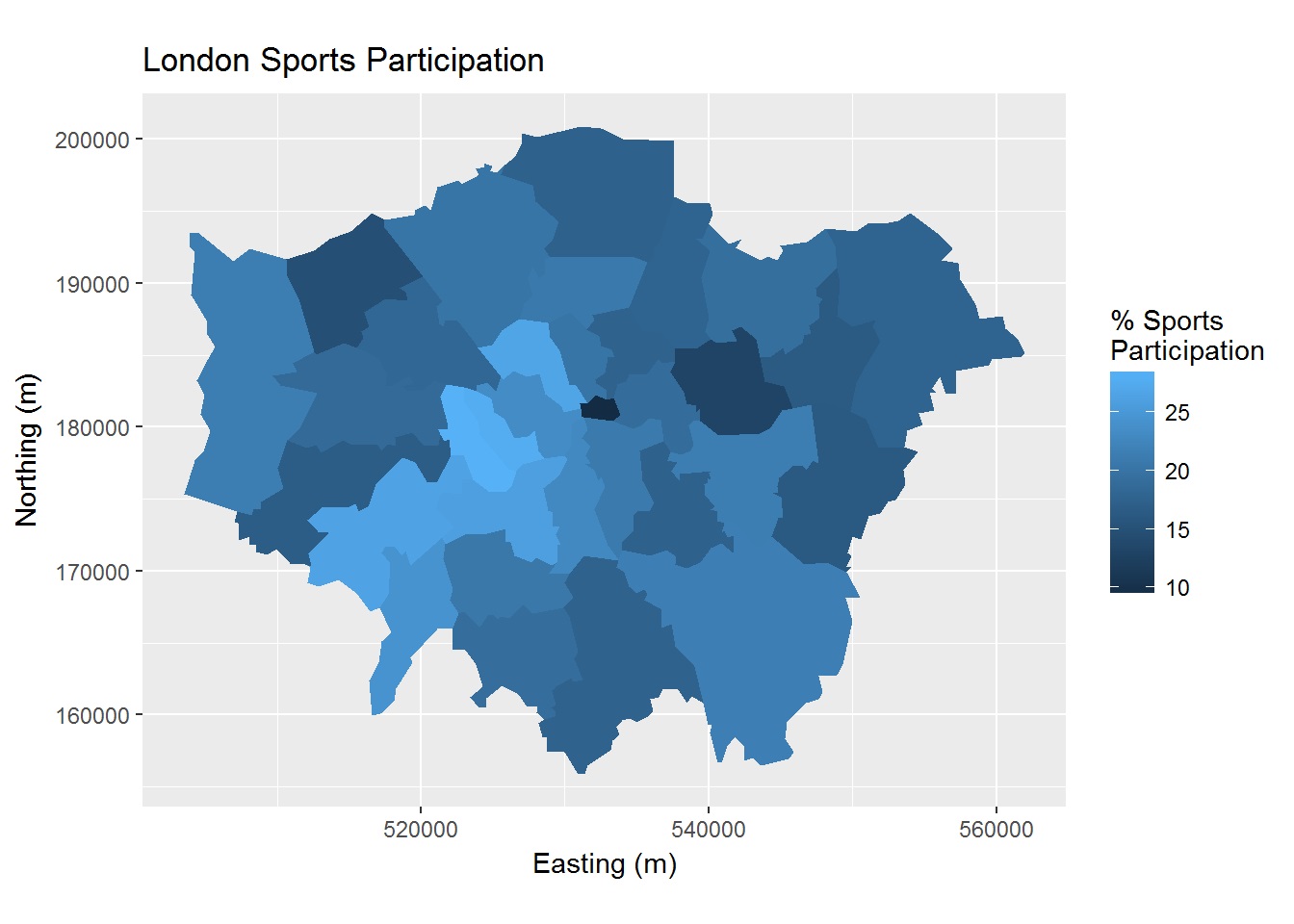
ggplot2
Unlike tmap, ggplot requires you to provide the database in data.frame format. This can be done through the fortify() function:
library(ggplot2)
library(dplyr)
lnd_f <- fortify(lnd)
head(lnd_f, n = 2)
lnd$id <- row.names(lnd) # Atribui um ID para a base sp
head(lnd@data, n = 2) # ultima checagem antes da junção (os nomes das variáveis precisam ser iguais)
lnd_f <-left_join(lnd_f, lnd@data) # juntou pela única variável com nome em comum
head(lnd_f, n = 2)
Now the lnd_f object can be used to create a map with ggplot:
map<-ggplot(lnd_f, aes(long, lat, group = group, fill = Partic_Per)) +
  geom_polygon() + coord_equal() +
  labs(x = "Easting (m)", y = "Northing (m)", fill = "% Sports\nParticipation") +
  ggtitle("London Sports Participation")
map
## trocando as cores
map + scale_fill_gradient(low = "red", high = "green")
## salvando o grafico com ggsave
ggsave("Sport Participation - London.jpg")
Interactive maps with leaflet
The leaflet package allows the creation of interactive maps and acts together with the shiny package, making the online visualization possible. The lnd object is with a Coordinate Reference System (CRS) that is not compatible with the leaflet. The display will be possible after the CRS of the lnd object is changed to the EPSG: 4326, which has been the most used one:
library(leaflet)
lnd84 <- spTransform(lnd, CRS("+init=epsg:4326")) #reprojeta
leaflet() %>%
   addTiles() %>%
   addPolygons(data = lnd84)
This map differs from the others because it allows a similar expirience to the use of googlemaps in the browser.
Next we have another example of visualization in the leaflet, but now we will use the shapefile of the Federal District, available on the IBGE website. After you download the file and sabe it to your current Working Directory, the first step is to assign the file to a new object, here called df_shp:
library(raster)
library(sp)
df_shp <- readOGR(dsn = "df_setores_censitarios", layer = "53SEE250GC_SIR")

# Criação do mapa com leaflet
df_shp@proj4string <- CRS("+init=epsg:4326") # reprojeta
df_leaf <- leaflet(data = df_shp) %>% addTiles()%>%
	addPolygons(fill = FALSE, weight = 1, stroke = TRUE, color = "#03F")%>%
	addLegend("bottomright", colors = "#03F", labels = "Distrito Federal")

df_leaf
The code above follows the same reasoning of the created for the map of London, but with some more configurations. The .shp file was inserted directly into the leaflet function and the addPolygons function included the fill, weight, stroke and color arguments, which respectively represent whether the interior of the polygons should receive some color, the thickness of the contour line, if the lines of the Polygons should be colored and which color should be chosen. The addLegend function creates a legend for the map. For more details on functions, simply run the following command:?Function-name.