“真金不怕火煉”
(Chinese saying: “True gold does not fear the test of fire”)
The views expressed in this work are of entire responsibility of the authors and do not necessarily reflect those of their respective affiliated institutions nor those of its members.
Motivation
COVID-19 (SARS-CoV-2) is an ongoing pandemic that infected more than 2.5 million people around the world and claimed more than 170,000 lives as of 21 April 2020. Unlike all other pandemics recorded in history, a large volume of data and news concerning COVID-19 are flowed in with great speed and coverage, mobilizing scholars from various fields of knowledge to focus their efforts on analyzing those data and proposing solutions.
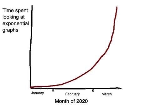
In epidemic data, it is natural to observe an exponential growth in the infected cases, especially in the early stages of the disease. As addressed in posts like this, measures of social isolation seek to “flatten the curve”, reducing the number of affected at the peak, but prolonging the “wave” over time. Similarly, the number of deaths also follows an exponential trend.
Analyzing data from countries affected by the pandemic, it is possible to observe patterns that are common to all. Despite the existence of several peculiarities such as territorial extension, population density, temperature, season, degree of underreporting, social discipline to comply with isolation measures, etc., which differ significantly between different countries, the virus has not (yet) suffered radical mutations since its appearance in China, such that the general parameters of infectivity and lethality are similar between countries. However, the Chinese data are a notable exception, showing a behavior that differs from the others – despite being the first country affected by the disease, the number of infected people evolution remained close to a linear trend in the early stages, followed by few moments that suffered abrupt variation and prolonged periods marked by the absence of variance, both unusual patterns in nature. Here are some graphs:
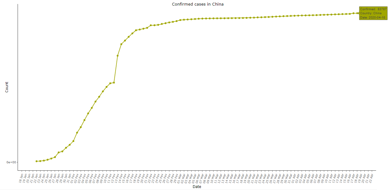 Image 1: Cumulative COVID-19 cases in China, as of 18 Apr 2020
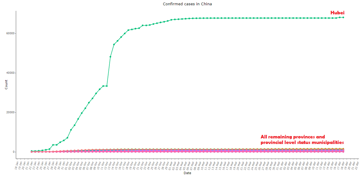 Image 2: Same as image 1, comparing the province of Hubei with all others
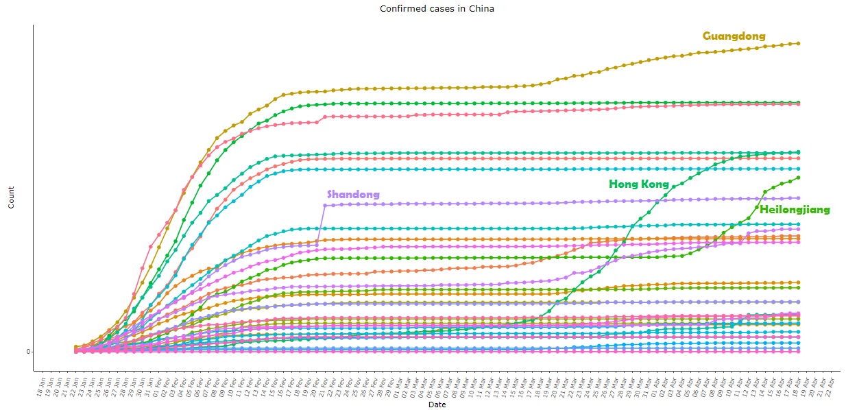 Image 3: Same as image 2, with all provinces except Hubei, re-scaled for better viewing
Image 1 above shows the cumulative number of confirmed cases of COVID-19 in China (Taiwan not included). Note that the exponential pattern appears at the beginning but the concavity of the curve changes rapidly, contrary to expectations and to what was observed in almost all other countries. The growth happened with “jumps” at the beginning of the series, followed by a practically linear trend in the first days of February, a single day of great growth, and a long period with decreasing new cases per day, until the curve became practically a straight line since the early March.
Furthermore, looking at the decomposition of the aggregate data for province-level in image 2, we can notice that a single province – Hubei – is responsible for almost all cases from China, while all other provinces (which also differ considerably among themselves in area, population density, temperature, distance to the virus’ city of origin, etc.) exhibited practically the same pattern, resulting in a sigmoid curve with surgical precision.
At the provincial level, the only place that showed some degree of variance over time was Hong Kong; in Shandong, there was a great variation in a single day – 21 February 2020, when an outbreak of the virus was reported in the Rencheng Prison in the city of Jining: on that day 203 people were added to the confirmed statistic, an isolated point in a “well behaved” curve in all periods besides that day. In Guangdong (in southern China) and Heilongjiang (in northeastern China) the series returned to grow in late March and early April, respectively, both after a long period with virtually no variation. See the behavior of the series of these provinces in image 3.
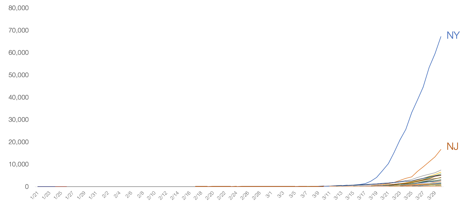 Image 4: Cumulative COVID-19 cases per state in the United States, as of 30 Mar 2020. Retrieved from “Coronavirus: Out of Many, One” by Tomas Pueyo
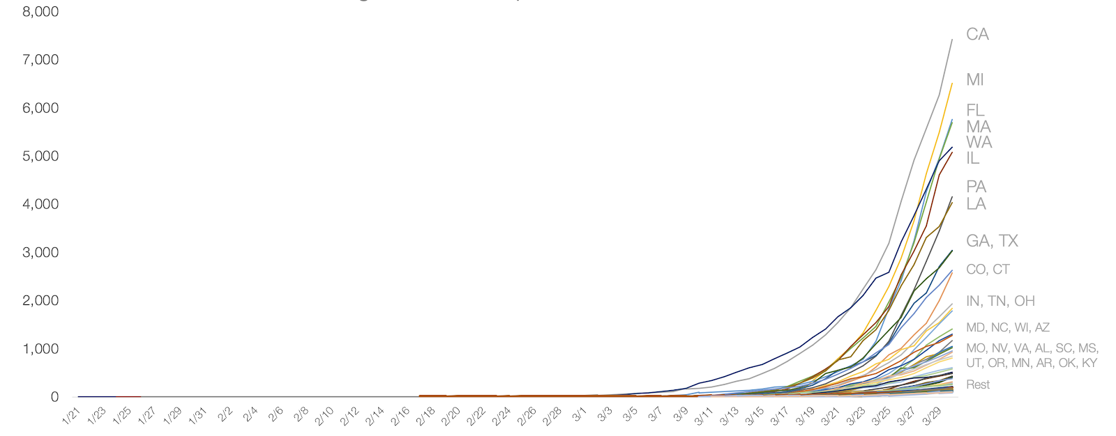 Image 5: Same as image 4, with all states except New York and New Jersey. Retrieved from “Coronavirus: Out of Many, One” by Tomas Pueyo
It is well known that the derivative of an exponential function is also an exponential, so it is expected that the daily variation of the confirmed cases would also follow an exponential. The Chinese data, however, showed something quite different:
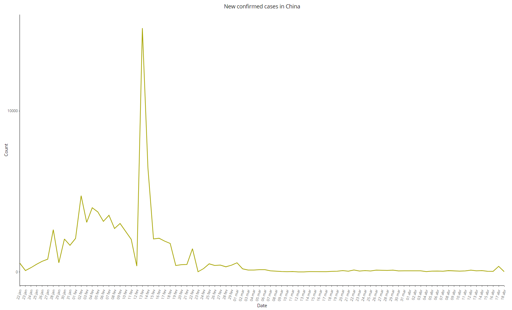 Image 6: Daily variation of COVID-19 cases in China, as of 18 Apr 2020
The initial section of the series seems more like a straight line than an exponential curve, considering the two peaks on January 28 and February 02, while the number of new cases started to decrease rapidly and without major variations – except for the peak of 15136 new cases on 13 February 2020, which clearly differs from the other periods. Disregarding this anomalous point, we can see a practically linear trend between February 02 and February 23, from which the series resembles a straight line – again, a rare pattern in contagious diseases.
See below the same graph comparing Hubei with all other provinces:
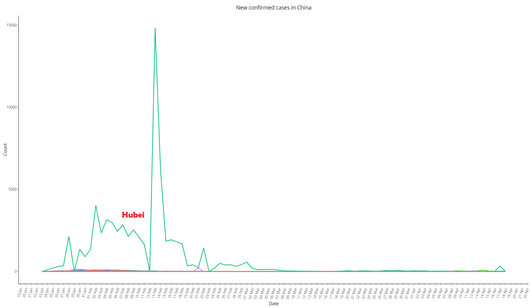 Image 7: Daily variation of COVID-19 cases in China, as of 18 Apr 2020, comparing Hubei with all other provinces
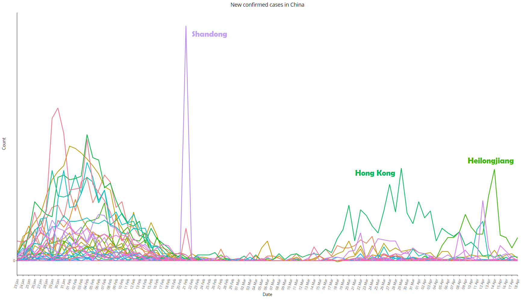 Image 8: Same as image 7, with all provinces except Hubei, re-scaled for better viewing
It is worth noting that, on the same day that anomalous peak occurred, Jiang Chaoliang and Ma Guoqiang were exonerated: they were the No. 1 and No. 2 in the Hubei command hierarchy (secretary-general and deputy secretary-general of the Party in the province, respectively).
The Chinese data for deaths from COVID-19 are also anti-intuitive, see below in images 9 to 11. Note that the second province with the most recorded deaths after Hubei was its neighbor Henan, with only 22 deaths. The daily variation in deaths is a practically stationary series, with the extra spice of the bizarre “adjustment” of 1290 deaths on April 17 after more than a month with almost no official deaths:
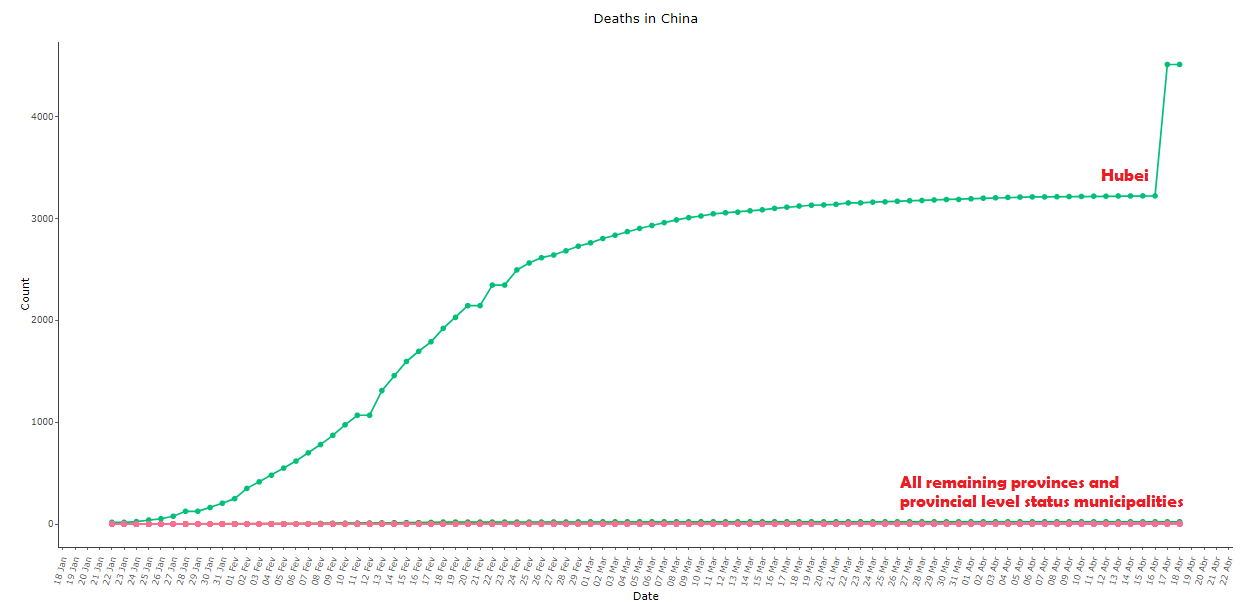 Image 9: Cumulative COVID-19 deaths in China, as of 18 Apr 2020, comparing Hubei with all other provinces
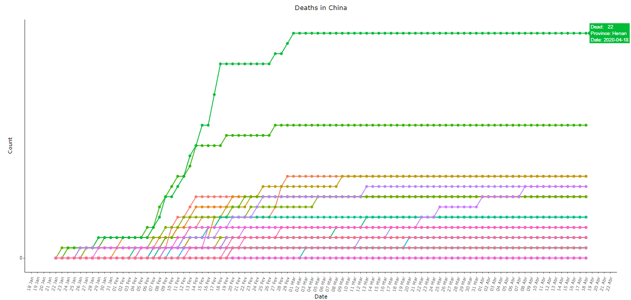 Image 10: Same as image 9, with all provinces except Hubei, re-scaled for better viewing
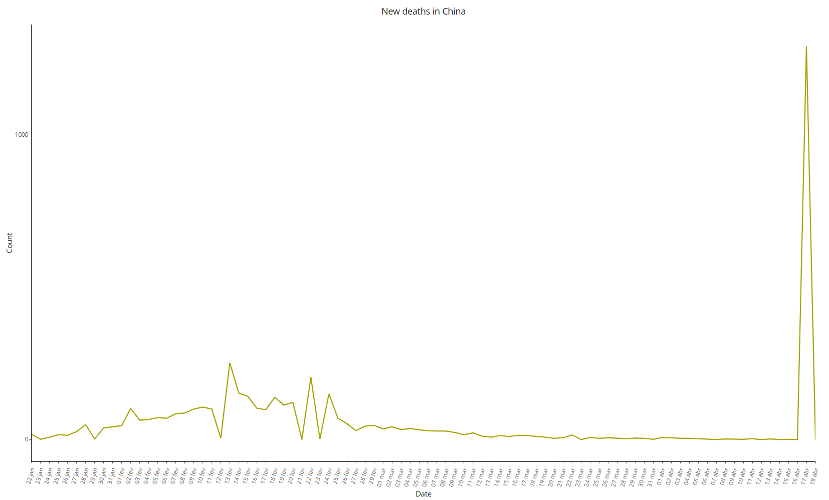 Image 11: Daily variation of COVID-19 deaths in China, as of 18 Apr 2020
The adoption of severe measures of social isolation influences the shape of the curves directly. However, the exponential pattern still remains at least in the initial stages, and the effects of those measures also take some time to become evident. Let’s compare the data from Japan, Singapore, and South Korea, which responded early to the disease, as well as from Italy, Spain, and the United Kingdom, which acted more intensely only in more advanced stages:
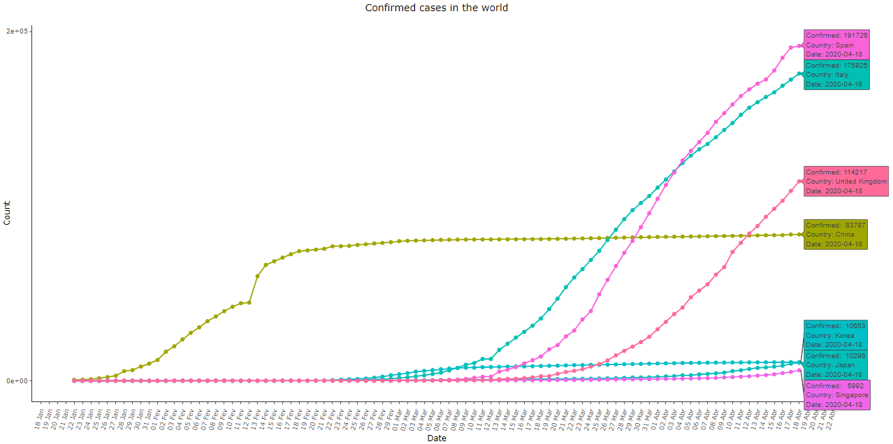 Imagem 12: Cumulative COVID-19 cases in Spain, Italy, United Kingdom, China, South Korea, Japan, and Singapore, as of 18 Apr 2020
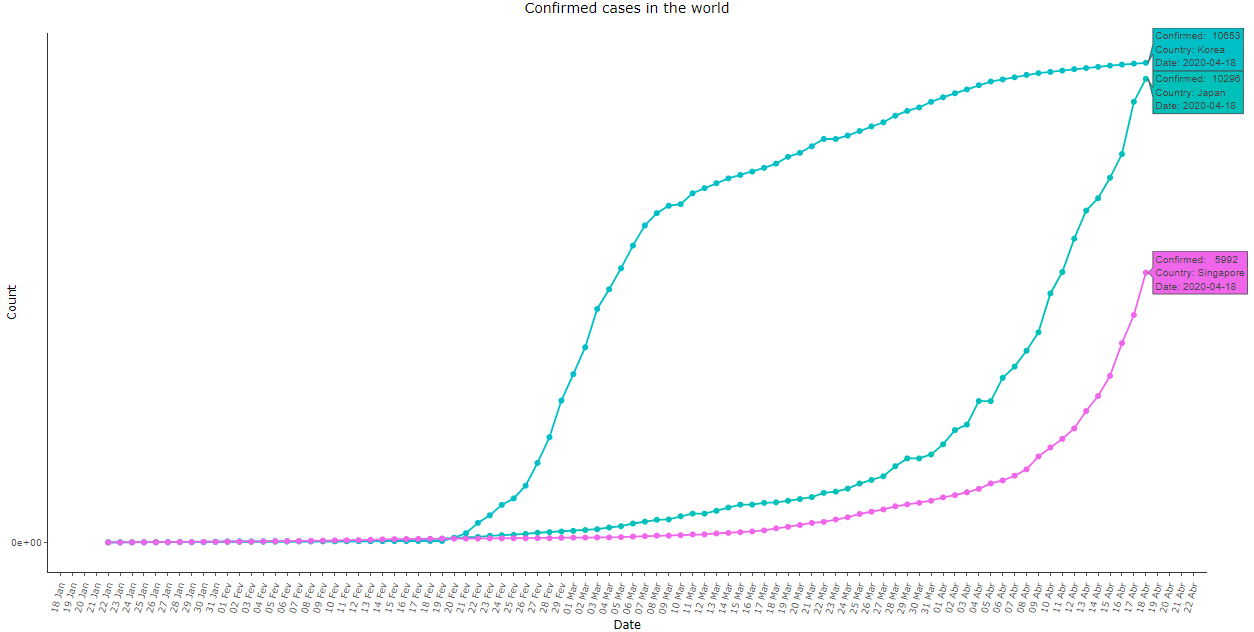 Imagem 13: Same as image 12, with the Asian countries except for China. Note that Japan and Singapore also exhibited a late exponential growth. Only South Korea’s curve exhibited a similar shape to the Chinese data
With the visual analysis above, we can deduce the existence of some underlying “pattern” in the COVID-19 data, but for some reason, it does not appear in the Chinese data. Next, let’s do an exercise trying to identify this pattern using Benford’s Law.
Benford’s Law
Life is mysterious and unexpected patterns rule the world. As they say, “life imitates art”. However, when art tries to imitate life, we can feel something strange, as if the complexity of life cannot be replaced by naive human engineering.
One of those patterns that seem to “emerge” in nature is Benford’s Law, discovered by Newcomb (1881) and popularized by Benford (1938), and widely used to check frauds in databases.
Benford, testing for more than 20 variables from different contexts, such as river sizes, population of cities, physics constants, mortality rate, etc., found out that the chance of the first digit of a number to be equal to 1 was the highest, chance that decreased progressively for the subsequent numbers. That is, it is more likely that the first digit of a number is 1, then 2, and successively up to 9.
Okhrimenko and Kopczewski (2019), two behavioral economists, tested people’s ability to create false data in order to circumvent the tax base. The authors found evidence that by the criteria of Benford’s law, the system would easily identify false data. Other applications of Benford’s Law for manipulated data identification and fraud detection include Hales et al. (2008), Abrantes- Metz et al. (2012), and Nigrini (2012).
How can we intuitively explain this seemingly random regularity? The answer is related to two known concepts: the exponential function and the logarithmic scale. Let’s review them as they are everywhere, especially during the current pandemic…
Epidemics such as the Coronavirus, which we are experiencing at the moment, are classic examples to explain the exponential function. The modeling happens as follows: the amount of infected tomorrow, \(I_1\), can be modeled as a constant \(\alpha\) times the amount of infected today, \(I_0\); that is, \(I_1 = \alpha \cdot I_0\).
Assuming that the rate is the same for tomorrow (we can interpret it as having no new policies, or no changes in population habits have occurred), the number of people infected the day after tomorrow, \(I_2\), is a proportion of what will be tomorrow (\(I_2=\alpha \cdot I_1\)), which in turn can be substituted by \(I_2=\alpha \cdot I_1 = \alpha \cdot \alpha \cdot I_0\). This expression can be generalized for \(t\) days from now: being \(t\) any positive integer, the generalization is \(I_t=\alpha^t \cdot I_0\). The virtually omnipresent compound interest from the financial numbers also follows the same logic (\(F = P(1+i)^n\)).
Here is the secret of Benford’s law. Let’s look at an exponentially growing epidemic simulation, that is, the number of infected at each day is a fixed multiple of the previous day. Let’s look at the standard scale and the logarithmic scale over time (in this case we use exponentials of 2, but it could be any positive integer). Note that in both cases, each gradation of blue is the area referring to a digit. The first corresponds between 10 and 20, the second between 20 and 30, so on until 100. Note that the width of the bands is different between the standard scale and the logarithmic scale.
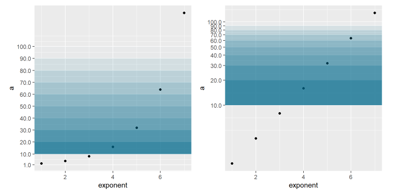 Imagem 14: Exponential function and logarithmic scale
This graph already gives us a clue as to why exponential phenomena may obey Benford’s law. When we look through the logarithmic lens, an exponential function looks like a function that grows linearly, and each observation is equidistant from the previous and the next observations. However, in this same logarithmic lens, the area between 10 and 20 is bigger than the area between 20 and 30, and so on. This means that the probability of the variable falling in the first range is greater than falling in the following ranges.
Using a technical jargon, the log mantissa is uniformly distributed. For a number \(x\) taken from a sample, let’s apply his log – for example, apply the log to the number 150: \(log_{10}(150) \approx 2,176\). We can decompose the result into the integer part \(m = 2\) and decimal part \(d = 0.176\). The decimal part is what we call mantissa.
Mantissa and theoretical distribution \(D_T\)
From the logarithm properties, \(log_{10} (150) = log_{10}(100 \cdot 1.5) = log_{10}(100) + log_{10}(1.5) = 2 + 0.176\). Note that the base 10 log of any integer power of 10 (100, 1000, 10000 …) will result in an integer. In this sense, the integer part of the base 10 log returns the number of digits that the original number has (since the Hindu-Arabic numeral system has 10 digits). The mantissa, on the other hand, is responsible for saying which is the first digit.
For numbers at the hundreds, when the mantissa is in the \([0, 0.301)\) range, the original number will be between \([100, 200)\). Doing the same procedure as above, when the number reaches 200, its log will result in \(log_{10}(200) = log_{10}(100 \cdot 2) = log_{10}(100) + log_{10}(2)\) which results in \(2 + 0.301\).
Now that we know that the mantissa is decisive for knowing the first digit, we can finally understand Benford’s law. Its idea is that the mantissa has a uniform distribution for digits 1 to 9. Thus, it is easier for 1 to be the leading digit because it has the largest interval of the mantissa \([0, 0.301)\).
We can define, according to Benford’s law, the probability for a number to have first digit equal to \(d\), given by:
\begin{equation} P(d)=\log_{10}\left(1+\frac{1}{d}\right), d = 1,…,9 \end{equation}
To save the reader’s time, we calculated the probability distribution for each digit to be the first according to Benford’s Law (\(D_T\)), as well as the respective intervals on the mantissa:
Table 1 : First digit distribution according to Benford’s Law
For more details on Benford’s law and its applications, take a look at these links [1; 2; 3]
Empirical distributions \(D_E\) of COVID-19 data
For this exercise, we picked the countries with more than 10,000 confirmed cases of COVID-19 as of April 18, 2020, according to the data available in this link. Let’s see below the first digit distributions of the time series of COVID-19 cases and deaths for the 24 selected countries:
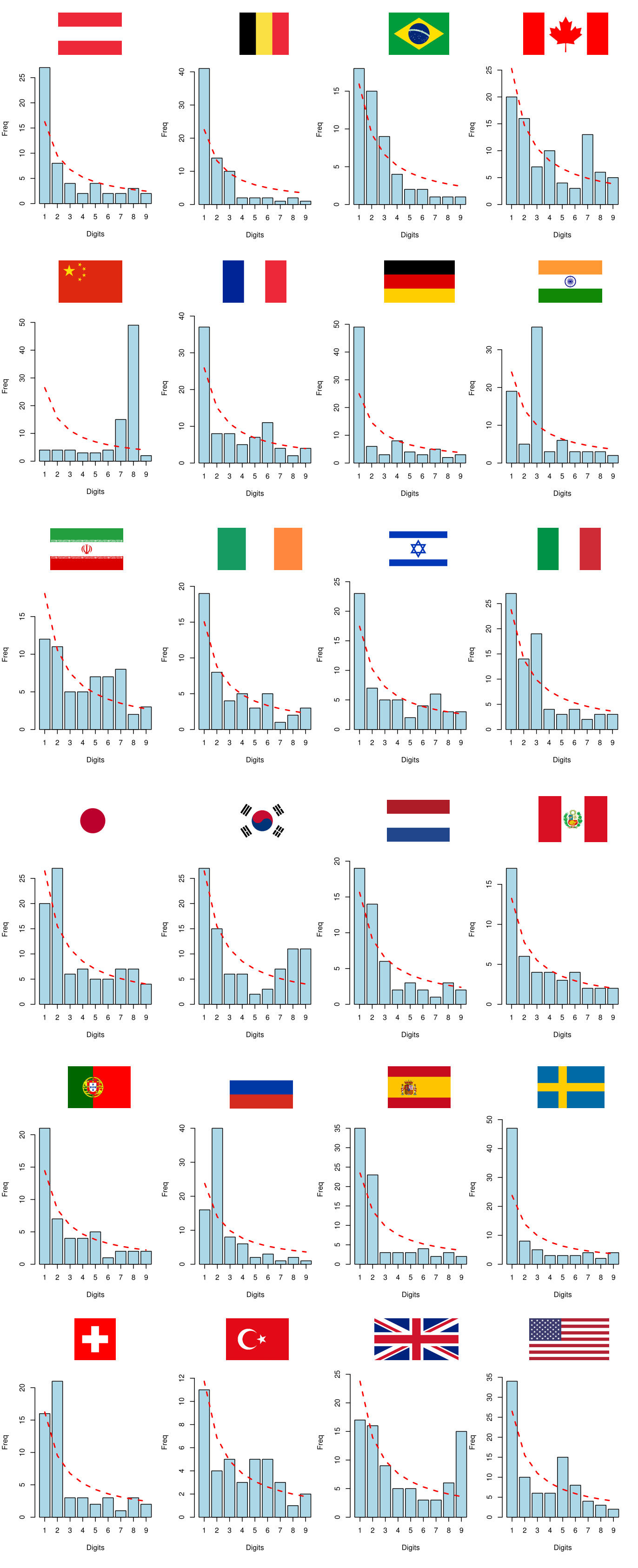 Image 15: First digit distributions of COVID-19 cases
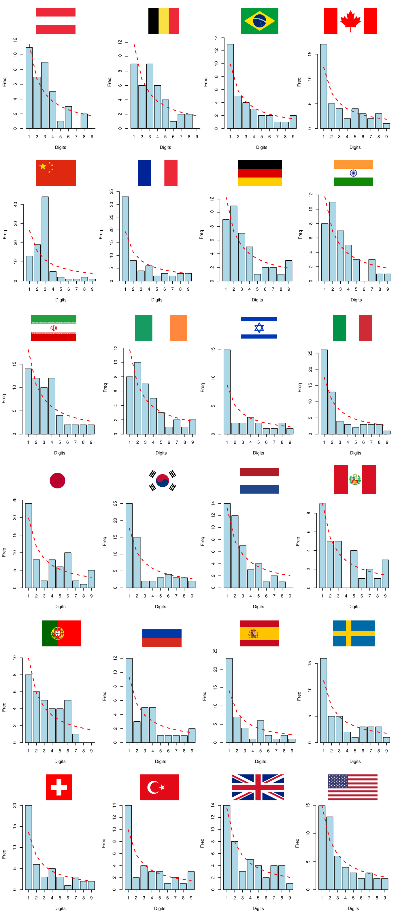 Image 16: First digit distributions of COVID-19 deaths
No database follows Benford’s Law perfectly, but China’s empirical distributions appear to be particularly different from those of other countries. By visual inspection, the data from China seems to be significantly desynchronized with Benford’s Law. For greater robustness, we will compare the empirical distributions \(D_E\) with the theoretical distribution \(D_T\) that comes from Benford’s Law by performing some hypothesis tests.
Hypothesis tests
For this exercise, we will perform three hypothesis tests:
- Chi-squared test
- Kolmogorov–Smirnov test (two-tailed)
- Kuiper’s test
The three tests above are similar, all of them have as a null hypothesis of equality between the empirical (\(D_E\)) and theoretical (\(D_T\)) distributions. The chi-squared test is the most commonly used, however, it tends to reject the null hypothesis more easily, while the KS test is less sensitive to pointwise differences; Kuiper’s test works in the same way as the KS test, with the difference that it considers separately positive and negative differences between the distributions (the case “\(D_E\) greater than \(D_T\)” is seen as different from the case “\(D_T\) greater than \(D_E\)”). The tables with the associated p-values are displayed below:
| Country/Test | Chi-squared | Kolmogorov-Smirnov | Kuiper |
|---|---|---|---|
| Austria | 0.1644 | 0.3364 | 0.7292 |
| Belgium | 0.0004 | 0.0366 | 0.0521 |
| Brazil | 0.2685 | 0.1243 | 0.4969 |
| Canada | 0.0117 | 1.0000 | 1.0000 |
| China | 0.0000 | 0.0086 | 0.0521 |
| France | 0.0363 | 0.9794 | 1.0000 |
| Germany | 0.0000 | 0.3364 | 0.4969 |
| India | 0.0000 | 0.1243 | 0.7292 |
| Iran | 0.1284 | 0.6994 | 0.7292 |
| Ireland | 0.8036 | 0.9794 | 0.7292 |
| Israel | 0.5245 | 0.9794 | 0.7292 |
| Italy | 0.0705 | 0.1243 | 0.0521 |
| Japan | 0.0509 | 0.9794 | 0.7292 |
| South Korea | 0.0002 | 0.9794 | 0.7292 |
| Netherlands | 0.4804 | 0.3364 | 0.7292 |
| Peru | 0.9629 | 0.6994 | 0.7292 |
| Portugal | 0.6247 | 0.3364 | 0.4969 |
| Russia | 0.0000 | 0.1243 | 0.1797 |
| Spain | 0.0027 | 0.0366 | 0.1797 |
| Sweden | 0.0000 | 0.1243 | 0.4969 |
| Switzerland | 0.0111 | 0.1243 | 0.1797 |
| Turkey | 0.6985 | 0.9794 | 0.7292 |
| United Kingdom | 0.0000 | 0.9794 | 0.9761 |
| United States | 0.0156 | 0.6994 | 0.7292 |
Table 2 : P-values of the hypothesis tests for COVID-19 cases data, rounded to 4 digits. Values with significance at 95% confidence level are marked in bold
| Country/Test | Chi-squared | Kolmogorov-Smirnov | Kuiper |
|---|---|---|---|
| Austria | 0.2883 | 0.6994 | 0.4969 |
| Belgium | 0.3746 | 0.9794 | 0.4969 |
| Brazil | 0.9773 | 0.9794 | 0.9761 |
| Canada | 0.7868 | 0.9794 | 0.7292 |
| China | 0.0000 | 0.1243 | 0.4969 |
| France | 0.0454 | 0.3364 | 0.7292 |
| Germany | 0.5473 | 0.6994 | 0.9761 |
| India | 0.3685 | 0.6994 | 0.4969 |
| Iran | 0.2098 | 0.3364 | 0.7292 |
| Ireland | 0.7039 | 0.9794 | 0.9761 |
| Israel | 0.4175 | 0.6994 | 0.4969 |
| Italy | 0.2414 | 0.3364 | 0.7292 |
| Japan | 0.0203 | 0.6994 | 0.7292 |
| South Korea | 0.1442 | 0.1243 | 0.7292 |
| Netherlands | 0.4993 | 0.3364 | 0.4969 |
| Peru | 0.5246 | 0.6994 | 0.7292 |
| Portugal | 0.3712 | 0.6994 | 0.1797 |
| Russia | 0.6750 | 0.3364 | 0.7292 |
| Spain | 0.1228 | 0.1243 | 0.4969 |
| Sweden | 0.7078 | 0.9794 | 0.7292 |
| Switzerland | 0.6034 | 0.6994 | 0.7292 |
| Turkey | 0.5745 | 0.9794 | 0.7292 |
| United Kingdom | 0.8325 | 0.9794 | 0.7292 |
| United States | 0.9284 | 0.6994 | 0.9761 |
Table 3 : P-values of the hypothesis tests for COVID-19 deaths data, rounded to 4 digits. Values with significance at 95% confidence level are marked in bold
Basically, the smaller the p-value, the less the data for the respective country seems to “obey” Benford’s Law. Using this evaluation metric, the Chinese data are clearly anomalous regarding Benford’s Law, while the vast majority of other countries seem to follow it reasonably well.
KL divergence and DBSCAN clustering
Now let’s see how “similar” the country data are to each other, using a metric called Kullback-Leibler divergence (henceforth “KL divergence”), which is a measure of relative entropy between two probability distributions. Its calculation for discrete distributions is given by the following expression:
\begin{equation} KL(D_1||D_2) = \sum\limits_{x \in \mathcal{P}}{D_1(x)\cdot log\left(\frac{D_1(x)}{D_2(x)}\right)} \end{equation}
The KL divergence gives the expected value of the logarithmic difference between two distributions \(D_1\) and \(D_2\) defined in the same probability space \(\mathcal{P}\); the theoretical discussion of this concept lies beyond the scope of this post, as it involves knowledge of information theory and measure theory. In simplified terms, the KL divergence measures how different two probability distributions are – the closer to zero its value, the more “similar” they are. As there are 24 countries, by comparing all empirical distributions \(D_E\) we yield 24x24 matrices that measure the “difference” between the data of the countries considered (one for the cases data and another for the deaths data), matrice whose main diagonals are all zero (the “difference” of something to itself is equal to zero!).
In table 4 below we present the matrix of KL divergences between the empirical distributions of confirmed cases data from the 24 selected countries. To save space, we omitted the matrix calculated from the deaths data.
| Austria | Belgium | Brazil | Canada | China | France | Germany | India | Iran | Ireland | Israel | Italy | Japan | South Korea | Netherlands | Peru | Portugal | Russia | Spain | Sweden | Switzerland | Turkey | United Kingdom | United States | |
|---|---|---|---|---|---|---|---|---|---|---|---|---|---|---|---|---|---|---|---|---|---|---|---|---|
| Austria | 0.0000 | 0.0409 | 0.0734 | 0.1005 | 0.5631 | 0.0387 | 0.0447 | 0.1739 | 0.1223 | 0.0371 | 0.0395 | 0.0595 | 0.0921 | 0.0778 | 0.0313 | 0.0268 | 0.0146 | 0.1832 | 0.0362 | 0.0214 | 0.0812 | 0.0826 | 0.1109 | 0.0410 |
| Belgium | 0.0409 | 0.0000 | 0.0452 | 0.1612 | 0.7024 | 0.0812 | 0.0956 | 0.1827 | 0.1964 | 0.0727 | 0.0819 | 0.0488 | 0.1466 | 0.1303 | 0.0397 | 0.0704 | 0.0556 | 0.1564 | 0.0539 | 0.0455 | 0.0995 | 0.1418 | 0.1662 | 0.1019 |
| Brazil | 0.0734 | 0.0452 | 0.0000 | 0.0981 | 0.5960 | 0.1057 | 0.1721 | 0.1647 | 0.1151 | 0.0601 | 0.0887 | 0.0252 | 0.0707 | 0.1151 | 0.0235 | 0.0650 | 0.0670 | 0.0532 | 0.0693 | 0.1201 | 0.0533 | 0.1100 | 0.0990 | 0.1111 |
| Canada | 0.1005 | 0.1612 | 0.0981 | 0.0000 | 0.3342 | 0.1223 | 0.1370 | 0.2187 | 0.0409 | 0.1111 | 0.0376 | 0.1266 | 0.0310 | 0.0433 | 0.1267 | 0.0698 | 0.0839 | 0.2046 | 0.1453 | 0.1418 | 0.1335 | 0.0830 | 0.0824 | 0.1181 |
| China | 0.5631 | 0.7024 | 0.5960 | 0.3342 | 0.0000 | 0.7432 | 0.7605 | 0.6701 | 0.5725 | 0.6681 | 0.5067 | 0.6763 | 0.4182 | 0.3305 | 0.6036 | 0.5808 | 0.6312 | 0.8489 | 0.7006 | 0.7566 | 0.6211 | 0.6705 | 0.4789 | 0.6572 |
| France | 0.0387 | 0.0812 | 0.1057 | 0.1223 | 0.7432 | 0.0000 | 0.0647 | 0.1576 | 0.0771 | 0.0246 | 0.0361 | 0.0719 | 0.1107 | 0.1180 | 0.0807 | 0.0137 | 0.0647 | 0.2226 | 0.0879 | 0.0524 | 0.1224 | 0.0256 | 0.1278 | 0.0244 |
| Germany | 0.0447 | 0.0956 | 0.1721 | 0.1370 | 0.7605 | 0.0647 | 0.0000 | 0.2417 | 0.1751 | 0.0690 | 0.0461 | 0.1260 | 0.1635 | 0.1181 | 0.1170 | 0.0521 | 0.0420 | 0.2765 | 0.0858 | 0.0206 | 0.1607 | 0.1151 | 0.1935 | 0.0691 |
| India | 0.1739 | 0.1827 | 0.1647 | 0.2187 | 0.6701 | 0.1576 | 0.2417 | 0.0000 | 0.2459 | 0.2386 | 0.2244 | 0.0706 | 0.2892 | 0.2965 | 0.1888 | 0.2027 | 0.2205 | 0.3063 | 0.3947 | 0.2911 | 0.3474 | 0.1517 | 0.2098 | 0.2509 |
| Iran | 0.1223 | 0.1964 | 0.1151 | 0.0409 | 0.5725 | 0.0771 | 0.1751 | 0.2459 | 0.0000 | 0.0947 | 0.0674 | 0.1353 | 0.0491 | 0.1192 | 0.1351 | 0.0598 | 0.1113 | 0.2188 | 0.1537 | 0.1645 | 0.1445 | 0.0292 | 0.1040 | 0.0680 |
| Ireland | 0.0371 | 0.0727 | 0.0601 | 0.1111 | 0.6681 | 0.0246 | 0.0690 | 0.2386 | 0.0947 | 0.0000 | 0.0321 | 0.0540 | 0.0644 | 0.0742 | 0.0472 | 0.0068 | 0.0459 | 0.1446 | 0.0583 | 0.0663 | 0.0632 | 0.0446 | 0.0790 | 0.0411 |
| Israel | 0.0395 | 0.0819 | 0.0887 | 0.0376 | 0.5067 | 0.0361 | 0.0461 | 0.2244 | 0.0674 | 0.0321 | 0.0000 | 0.0719 | 0.0621 | 0.0432 | 0.0809 | 0.0184 | 0.0456 | 0.2038 | 0.0847 | 0.0467 | 0.1104 | 0.0476 | 0.0952 | 0.0578 |
| Italy | 0.0595 | 0.0488 | 0.0252 | 0.1266 | 0.6763 | 0.0719 | 0.1260 | 0.0706 | 0.1353 | 0.0540 | 0.0719 | 0.0000 | 0.1031 | 0.1094 | 0.0357 | 0.0558 | 0.0724 | 0.1237 | 0.1236 | 0.1072 | 0.1077 | 0.0759 | 0.0870 | 0.1073 |
| Japan | 0.0921 | 0.1466 | 0.0707 | 0.0310 | 0.4182 | 0.1107 | 0.1635 | 0.2892 | 0.0491 | 0.0644 | 0.0621 | 0.1031 | 0.0000 | 0.0537 | 0.0528 | 0.0651 | 0.0831 | 0.0927 | 0.0679 | 0.1534 | 0.0386 | 0.1049 | 0.0596 | 0.1089 |
| South Korea | 0.0778 | 0.1303 | 0.1151 | 0.0433 | 0.3305 | 0.1180 | 0.1181 | 0.2965 | 0.1192 | 0.0742 | 0.0432 | 0.1094 | 0.0537 | 0.0000 | 0.0883 | 0.0726 | 0.0863 | 0.2317 | 0.1205 | 0.1145 | 0.1041 | 0.1254 | 0.0397 | 0.1473 |
| Netherlands | 0.0313 | 0.0397 | 0.0235 | 0.1267 | 0.6036 | 0.0807 | 0.1170 | 0.1888 | 0.1351 | 0.0472 | 0.0809 | 0.0357 | 0.0528 | 0.0883 | 0.0000 | 0.0457 | 0.0423 | 0.0785 | 0.0317 | 0.0859 | 0.0276 | 0.1009 | 0.0683 | 0.0821 |
| Peru | 0.0268 | 0.0704 | 0.0650 | 0.0698 | 0.5808 | 0.0137 | 0.0521 | 0.2027 | 0.0598 | 0.0068 | 0.0184 | 0.0558 | 0.0651 | 0.0726 | 0.0457 | 0.0000 | 0.0328 | 0.1594 | 0.0626 | 0.0530 | 0.0767 | 0.0290 | 0.0820 | 0.0257 |
| Portugal | 0.0146 | 0.0556 | 0.0670 | 0.0839 | 0.6312 | 0.0647 | 0.0420 | 0.2205 | 0.1113 | 0.0459 | 0.0456 | 0.0724 | 0.0831 | 0.0863 | 0.0423 | 0.0328 | 0.0000 | 0.1745 | 0.0625 | 0.0453 | 0.0908 | 0.0611 | 0.0931 | 0.0314 |
| Russia | 0.1832 | 0.1564 | 0.0532 | 0.2046 | 0.8489 | 0.2226 | 0.2765 | 0.3063 | 0.2188 | 0.1446 | 0.2038 | 0.1237 | 0.0927 | 0.2317 | 0.0785 | 0.1594 | 0.1745 | 0.0000 | 0.0920 | 0.2830 | 0.0342 | 0.2555 | 0.1539 | 0.2438 |
| Spain | 0.0362 | 0.0539 | 0.0693 | 0.1453 | 0.7006 | 0.0879 | 0.0858 | 0.3947 | 0.1537 | 0.0583 | 0.0847 | 0.1236 | 0.0679 | 0.1205 | 0.0317 | 0.0626 | 0.0625 | 0.0920 | 0.0000 | 0.0725 | 0.0254 | 0.1403 | 0.1252 | 0.0915 |
| Sweden | 0.0214 | 0.0455 | 0.1201 | 0.1418 | 0.7566 | 0.0524 | 0.0206 | 0.2911 | 0.1645 | 0.0663 | 0.0467 | 0.1072 | 0.1534 | 0.1145 | 0.0859 | 0.0530 | 0.0453 | 0.2830 | 0.0725 | 0.0000 | 0.1327 | 0.1115 | 0.1644 | 0.0723 |
| Switzerland | 0.0812 | 0.0995 | 0.0533 | 0.1335 | 0.6211 | 0.1224 | 0.1607 | 0.3474 | 0.1445 | 0.0632 | 0.1104 | 0.1077 | 0.0386 | 0.1041 | 0.0276 | 0.0767 | 0.0908 | 0.0342 | 0.0254 | 0.1327 | 0.0000 | 0.1652 | 0.0918 | 0.1397 |
| Turkey | 0.0826 | 0.1418 | 0.1100 | 0.0830 | 0.6705 | 0.0256 | 0.1151 | 0.1517 | 0.0292 | 0.0446 | 0.0476 | 0.0759 | 0.1049 | 0.1254 | 0.1009 | 0.0290 | 0.0611 | 0.2555 | 0.1403 | 0.1115 | 0.1652 | 0.0000 | 0.1053 | 0.0319 |
| United Kingdom | 0.1109 | 0.1662 | 0.0990 | 0.0824 | 0.4789 | 0.1278 | 0.1935 | 0.2098 | 0.1040 | 0.0790 | 0.0952 | 0.0870 | 0.0596 | 0.0397 | 0.0683 | 0.0820 | 0.0931 | 0.1539 | 0.1252 | 0.1644 | 0.0918 | 0.1053 | 0.0000 | 0.1764 |
| United States | 0.0410 | 0.1019 | 0.1111 | 0.1181 | 0.6572 | 0.0244 | 0.0691 | 0.2509 | 0.0680 | 0.0411 | 0.0578 | 0.1073 | 0.1089 | 0.1473 | 0.0821 | 0.0257 | 0.0314 | 0.2438 | 0.0915 | 0.0723 | 0.1397 | 0.0319 | 0.1764 | 0.0000 |
Table 4: Pairwise KL divergences between the analyzed countries COVID-19 cases first digit distributions, rounded to 4 digits
The matrix above does not have a very immediate practical interpretation, so we applied a clustering algorithm to define which countries are most similar to each other – pairs of countries with a larger KL divergence are less similar to each other than pairs of countries with a smaller KL divergence. The chosen algorithm was DBSCAN, which assigns each point in the sample to clusters based on the minimum number of points in each cluster (\(mp\)) and the maximum distance that a point have to another point of the same cluster (\(\varepsilon\)). Points that do not have at least \(mp\) points within the radius of \(\varepsilon\) are classified as outliers that belong to no cluster. A good introductory material on DBSCAN can be found here.
One of the advantages of DBSCAN is the fact that the cluster number is automatically defined instead of being chosen by the user, making it a good tool for anomaly detection. For this exercise, we used \(mp = 3\) and \(\varepsilon\) as the average of the KL divergences between countries plus three sample standard deviations. The result of this clustering is easier to interpret:
| Country | Cluster |
|---|---|
| Austria | 1 |
| Belgium | 1 |
| Brazil | 1 |
| Canada | 1 |
| China | Outlier |
| France | 1 |
| Germany | 1 |
| India | Outlier |
| Iran | 1 |
| Ireland | 1 |
| Israel | 1 |
| Italy | 1 |
| Japan | 1 |
| South Korea | 1 |
| Netherlands | 1 |
| Peru | 1 |
| Portugal | 1 |
| Russia | 1 |
| Spain | 1 |
| Sweden | 1 |
| Switzerland | 1 |
| Turkey | 1 |
| United Kingdom | 1 |
| United States | 1 |
Table 5: DBSCAN clustering between the KL divergences of COVID-19 cases time series first digit distributions of the analyzed countries
| Country | Cluster |
|---|---|
| Austria | 1 |
| Belgium | 1 |
| Brazil | 1 |
| Canada | 1 |
| China | Outlier |
| France | 1 |
| Germany | 1 |
| India | 1 |
| Iran | 1 |
| Ireland | 1 |
| Israel | 1 |
| Italy | 1 |
| Japan | 1 |
| South Korea | 1 |
| Netherlands | Outlier |
| Peru | Outlier |
| Portugal | Outlier |
| Russia | 1 |
| Spain | 1 |
| Sweden | 1 |
| Switzerland | 1 |
| Turkey | 1 |
| United Kingdom | 1 |
| United States | 1 |
Table 6: DBSCAN clustering between the KL divergences of COVID-19 deaths time series first digit distributions of the analyzed countries
Again, as suggested by the visual inspection and hypothesis tests aforementioned, the results indicate that the data from China show distinct patterns from the majority of the countries most affected by the pandemic, which in turn showed similar patterns of infectivity and lethality: the algorithm returned only one cluster, classifying China as “outlier” for both data of case numbers and death numbers. Indeed, countries categorized as “cluster 1” seem to follow the distribution of Benford’s Law better.
Although China is the place of origin of the disease, given the great divergence between its data and the data from other locations, Chinese data should be used with special caution for analyzes such as estimating COVID-19’s pathogen parameters (basic reproducing number, serial interval, and case-fatality ratio, for instance), modeling the geographic dispersion of the pathogen, diagnosing the effectiveness of intervention scenarios, etc.
Final remarks
As the pandemic affects more and more people and has an increasingly deeper impact on economic activities and social life at a global level, discussing the underreporting of COVID-19 data becomes especially relevant, both for the assessment of the situation severity and for the proposal of solutions and means to overcome the crisis. Given that scholars, researchers, and policy-makers around the world are dedicated to this cause, having accurate and reliable data at hand is of paramount importance, as the quality of the data directly affects the quality of all analyses derived from them. As the saying goes: “Garbage in, garbage out!“
Sometimes, “coincidence” is just a way for someone to avoid the facts that he failed to explain.
