Stock and investments analysis is a theme that can be deeply explored in programming. This includes R language, which already has a big literature, packages and functions developed in this matter. In this post, we’ll do a brief introduction to the subject using the packages quantmod and ggplot2.
For those who are beginning, R is a programming language and integrated enviroment focused in statistics, but with a lot of applications in different areas. The software download can be done here using your preferred mirror. I also recommend installing RStudio, which is an interface with a lot of additional resources for R.
The analyzed stock here will be PBR, from the brazilian company Petrobras, with data extracted from Yahoo Finance using the package quantmod. quantmod is a well known package used to quantitave financial modelling. Also, we’ll use the package ggplot2 for data visualization.
Preparing the environment
The environment preparation is quite simple, even for those who are beginning or those who aren’t used to code. Firstly, we install and load the necessary packages.
rm(list=ls())
install.packages("quantmod")
install.packages("ggplot2")
library(quantmod)
library(ggplot2)
I think it’s important to highlight that we only install the packages once. In the next times we run the code, it’ll be necessary only to load them using the library command.
After installing and loading the packages, now we’ll download the stock prices series and treat the data in order to get them in the best possible format for the analysis. We download the data using the function getSymbols.
pbr <- getSymbols("PBR", src = "yahoo", from = "2013-01-01", to = "2017-06-01", auto.assign = FALSE)
Let’s do it step by step!
The first argument PBR is the symbol in Yahoo Finance of the stock that we’re going to analyze. If you want to look for other stock or asset, you can search its symbol here.
The argument src= "yahoo" indicates the source of the data. We can also use other sources like Google Finance, FRED, Oanda, local databases, CSVs and many others.
The third and fourth arguments indicate the time period in which the data is going to be extracted, with data in the format “yyyy-mm-dd”.
Lastly, the argument auto.assign = FALSE allows us to name the dataset with the name we want. In case it’s TRUE, the name automatically will be the symbol we’re looking for, that is, the first argument.
Addendum
If Yahoo Finance API is not working, it’s possible to download the prices straight from the website. You just have to search for the stock tick or company name. In the asset page, click on “Historical Data”, just like the image below:
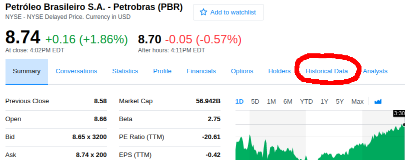
Then, select the desired period and click on “Download Data”. The download file will be in the format csv. Now, just move it for your working directory, that can be discovered using the command getwd().
With the file in the folder, use the following commands to read the base:
pbr <- read.csv("PBR.csv")
pbr[,1] <- as.Date(pbr[,1])
pbr <- xts(pbr)
pbr <- pbr[,-1]
The command read.csv() reads the file and assigns it to an object. Then, we transform the first column of the base to date format. Next, we use the command xts() to transform the base from dataframe type to xts. Lastly, we remove the first column (date), since now the price lines are already indexed by day.
Prices Visualization
Now let’s take a brief look at the data, just to know them better. Run the following lines and analyze each output.
head(pbr)
tail(pbr)
summary(pbr)
str(pbr)
##           PBR.Open PBR.High PBR.Low PBR.Close PBR.Volume PBR.Adjusted
## 2012-01-03   26.993   28.025  26.939     26.11   12754300     24.54040
## 2012-01-04   27.567   28.280  27.567     26.46   12351500     24.86936
## 2012-01-05   27.993   28.057  27.525     26.11    8568600     24.54040
## 2012-01-06   27.929   27.929  27.280     25.69    8532100     24.14565
## 2012-01-09   27.748   28.695  27.588     26.88   26046600     25.26411
## 2012-01-10   29.078   29.461  28.993     27.45   16966500     25.79985
##            PBR.Open PBR.High PBR.Low PBR.Close PBR.Volume PBR.Adjusted
## 2017-05-23     8.76     8.91    8.74      8.83   22071200         8.83
## 2017-05-24     8.95     9.20    8.88      9.08   25863100         9.08
## 2017-05-25     9.07     9.25    8.81      8.89   30557400         8.89
## 2017-05-26     8.74     9.03    8.72      8.95   22845300         8.95
## 2017-05-30     8.85     8.90    8.69      8.70   21082600         8.70
## 2017-05-31     8.67     8.76    8.44      8.48   23066100         8.48
##      Index               PBR.Open        PBR.High        PBR.Low
##  Min.   :2013-01-02   Min.   : 2.88   Min.   : 2.97   Min.   : 2.71
##  1st Qu.:2014-02-08   1st Qu.: 7.05   1st Qu.: 7.20   1st Qu.: 6.82
##  Median :2015-03-18   Median :10.25   Median :10.40   Median :10.08
##  Mean   :2015-03-17   Mean   :10.67   Mean   :10.86   Mean   :10.46
##  3rd Qu.:2016-04-23   3rd Qu.:14.42   3rd Qu.:14.60   3rd Qu.:14.15
##  Max.   :2017-05-31   Max.   :20.83   Max.   :20.94   Max.   :19.96

##    PBR.Close        PBR.Volume         PBR.Adjusted
##  Min.   : 2.900   Min.   :  6046400   Min.   : 2.900
##  1st Qu.: 7.005   1st Qu.: 17193900   1st Qu.: 7.005
##  Median :10.210   Median : 24066300   Median :10.230
##  Mean   :10.657   Mean   : 27527831   Mean   :10.814
##  3rd Qu.:14.330   3rd Qu.: 33655150   3rd Qu.:14.615
##  Max.   :20.650   Max.   :164885500   Max.   :20.650
## An 'xts' object on 2013-01-02/2017-05-31 containing:
##   Data: num [1:1111, 1:6] 18.9 18.7 19.2 19.2 18.9 ...
##  - attr(*, "dimnames")=List of 2
##   ..$ : NULL
##   ..$ : chr [1:6] "PBR.Open" "PBR.High" "PBR.Low" "PBR.Close" ...
##   Indexed by objects of class: [Date] TZ: UTC
##   xts Attributes:
## List of 2
##  $ src    : chr "yahoo"
##  $ updated: POSIXct[1:1], format: "2017-07-16 20:52:31"
With the commands head() and tail() we can see the first and last 6 lines of the base. There are 6 columns with: opening price, maximum and minimum prices, closing price, volume of transactions and adjusted price. Using the command summary() we verify the descriptive statistics of each price series and volume. The command str() returns the object structure. In this case, it’s a xts object, a time series.
Now let’s plot daily prices, using the Adjusted Price column, since it incorporates events like splits and dividends distribution, which can affect the series.
ggplot(pbr, aes(x = index(pbr), y = pbr[,6])) + geom_line(color = "darkblue") + ggtitle("Petrobras prices series") + xlab("Date") + ylab("Price") + theme(plot.title = element_text(hjust = 0.5)) + scale_x_date(date_labels = "%b %y", date_breaks = "6 months")
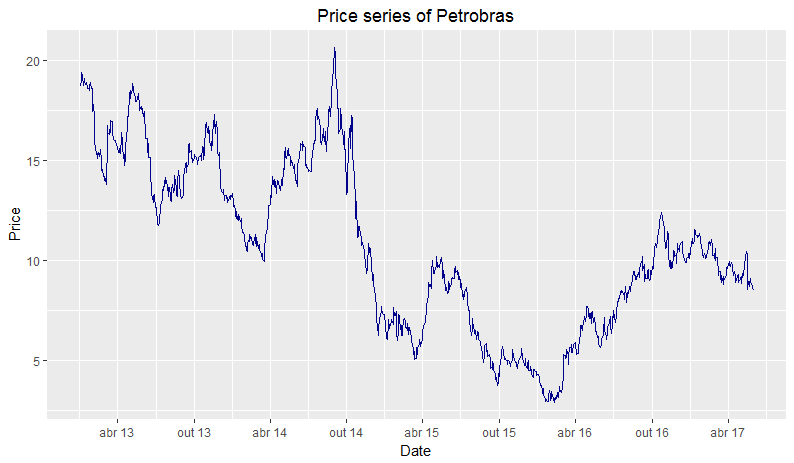
We created this graphic using the command ggplot. First, we use the object pbr as the series to be ploted. Then we indicate which elements will be in the axes: index(pbr), the date in x-axis, and the adjusted price column, pbr[,6], in y-axis. Next, we add the element to be ploted, in this case, a blue line: geom_line(color = "darkblue").
Afterwards, we include the title and names of the axes, with the commands ggtitle("Petrobras prices series"), xlab("Date"), ylab("Price"). By standard, the graph title is aligned to the left. To centralize it, the command theme(plot.title = element_text(hjust = 0.5)) is used.
Lastly, to make the temporal axis more informative, we put the date tick at every 6 months in the format mmm aa using scale_x_date(date_labels = "%b %y", date_breaks = "6 months").
In stocks Technical Analysis, a very used technique is the plot of Moving Averages in the prices graphs. A simple moving average is an arithmetic average from the last \(q\) days from a \(x_{t}\) series in the \(t\) time period. So, the moving average \(MA^{q}_{t}\) is given by:
\[MA^{q}_{t}= \frac{1}{q} \sum_{i=0}^{q-1}x_{t-1}\]This indicator is interesting because it helps to identify trends and smooths noises from prices. That is, the bigger the days window for the MA calculation, smaller is the MA responsiveness to price variation. The smaller the window, the faster MA adapts itself to changes. Now let’s calculate two moving averages for the stock prices series, one with 10 days window and the other with 30 days:
pbr_mm <- subset(pbr, index(pbr) >= "2016-01-01")

pbr_mm10 <- rollmean(pbr_mm[,6], 10, fill = list(NA, NULL, NA), align = "right")
pbr_mm30 <- rollmean(pbr_mm[,6], 30, fill = list(NA, NULL, NA), align = "right")

pbr_mm$mm10 <- coredata(pbr_mm10)
pbr_mm$mm30 <- coredata(pbr_mm30)
First we subset the base for data since 2016 using the function subset(). Then, we use the function rollmean(), which takes as argument: the series \((x_t)\), in this case the adjusted price; the window of periods \((q)\); an optional fill argument, that is used to complete the days where it’s not possible to calculate the moving average, since the enough quantity of days hasn’t passed; the argument align indicates if the moving average should be calculated using the periods in the left, in the center or in the right of the \(t\) day of the series. Lastly, we add the MA to two new columns in the initial database.
We calculated the two MA using 10 and 30 days of windows, filling the values with NA and using the periods in the left. Afterwards, we can plot both series in the same graphic of prices to identify trends. An existing theory in Technical Analysis is the one that when two MA of short and long term cross each other, there is an indication of buying or selling the stock. When the short term MA cross the long term upwards, there’s a buy a signal. When the opposite happens, there’s a sell signal.
Ploting the prices series and the moving averages for all days since 2016:
ggplot(pbr_mm, aes(x = index(pbr_mm))) +
  geom_line(aes(y = pbr_mm[,6], color = "PBR")) + ggtitle("Petrobras prices series") +
  geom_line(aes(y = pbr_mm$mm10, color = "MM10")) +
  geom_line(aes(y = pbr_mm$mm30, color = "MM30")) + xlab("Date") + ylab("Price") +
  theme(plot.title = element_text(hjust = 0.5), panel.border = element_blank()) +
  scale_x_date(date_labels = "%b %y", date_breaks = "3 months") +
  scale_colour_manual("Series", values=c("PBR"="gray40", "MM10"="firebrick4", "MM30"="darkcyan"))
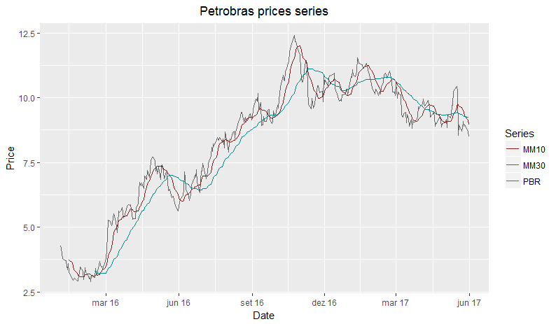
To create the graph, we plot the line of prices and the lines of moving averages. In this case, we plot each line differently, creating a kind of nickname for the color of each one. Then, we add the line scale_colour_manual, indicating the color of each nickname in order to make the color visible in the legend of the graph.
Verifying the plot, it’s possible to notice that there were 14 points in which the series crossed themselves and 1 point where they overlapped. Following the buy signal, we’d have been successful in 4 of 7 times. Following the sell indication, we’d have done right 5 in 7 times. In total, we’d be 9/14, that is 64% of success with a quite simple indicator. Of course this metric shouldn’d be used alone, many other informations should be considerated.
Returns!
We have seen how the stock price has changed over time. Now we’ll verify how the stock return has behaved in the same period. To do this, we first need to create a new object with the calculated returns, using the adjusted prices column:
pbr_ret <- diff(log(pbr[,6]))
pbr_ret <- pbr_ret[-1,]
What we’ve done here was using logarithm properties to calculate the log-return of the stock. We did:
\[r_{t} = ln(1+R_t) = ln\bigg(\frac{P_t}{P_{t-1}}\bigg) = ln(P_{t})-ln(P_{t-1}) \approx R_{t}\]The diff command calculates the difference of all values in any vector or element. With this, we only apply the difference to natural logarithms of stock prices.
In addition to this way, it’s possible to calculate returns differently. The package quantmod has some interesting functions to do this. Firstly, it’s really simple to select only one column of prices of each stock. For example:
Op(pbr)
Cl(pbr)
Ad(pbr)
Each line will have as output the opening, closing and adjusted prices, respectively. The same accounts for other columns: Hi(), Lo() and Vo(), for maximum and minimum prices and volume of transactions.
For the returns, we simply adapt and define which columns will be used, for example: ClCl() will give us the returns using the closing prices from two periods; OpCl() will result in the return from the closing price over the opening price from the same day.
Another interesting possibility given by quantmod is the calculation of returns for different periods. For example, it’s possible to calculate the returns by day, week, month, quarter and year, just by using the following commands:
dailyReturn(pbr)
weeklyReturn(pbr)
monthlyReturn(pbr)
quarterlyReturn(pbr)
yearlyReturn(pbr)
All these commands make the analysis and the calculation much faster and simpler to do.
Now let’s verify some basic statistics from Petrobras returns.
summary(pbr_ret)

##      Index             PBR.Adjusted
##  Min.   :2013-01-03   Min.   :-0.1852413
##  1st Qu.:2014-02-10   1st Qu.:-0.0209915
##  Median :2015-03-18   Median :-0.0005999
##  Mean   :2015-03-18   Mean   :-0.0007548
##  3rd Qu.:2016-04-24   3rd Qu.: 0.0177905
##  Max.   :2017-05-31   Max.   : 0.1555103
sd(pbr_ret)

## [1] 0.03713089
This indicates that in average the stock hasn’t performed well. Now we can plot the returns and see how they’ve done over time:
ggplot(pbr_ret, aes(x = index(pbr_ret), y = pbr_ret)) +
  geom_line(color = "deepskyblue4") +
  ggtitle("Petrobras returns series") +
  xlab("Date") + ylab("Return") +
  theme(plot.title = element_text(hjust = 0.5)) + scale_x_date(date_labels = "%b %y", date_breaks = "6 months")
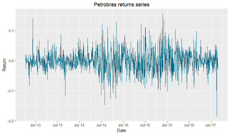
To plot this last graph, we used the same parameters of the prices graph, changing only the line color.
Making a brief analysis of the graphic, it’s possible to see that the smallest return of the series happened around may. More specifically, in may 18, one day after the news release with recordings of brazilian president Michel Temer. In the audios, he agreed to give payments in exchange of silence from arrested politicians. This fact strongly impacted the stocks market, specially brazilian and public companies, like Petrobras.
Now let’s take a small look at the stock returns in 2017:
pbr_ret17 <- subset(pbr_ret, index(pbr_ret) > "2017-01-01")

ggplot(pbr_ret17, aes(x = index(pbr_ret17), y = pbr_ret17)) +
  geom_line(color = "deepskyblue4") +
  ggtitle("Petrobras returns series in 2017") + xlab("Date") + ylab("Return") +
  theme(plot.title = element_text(hjust = 0.5)) + scale_x_date(date_labels = "%b %y", date_breaks = "1 months")
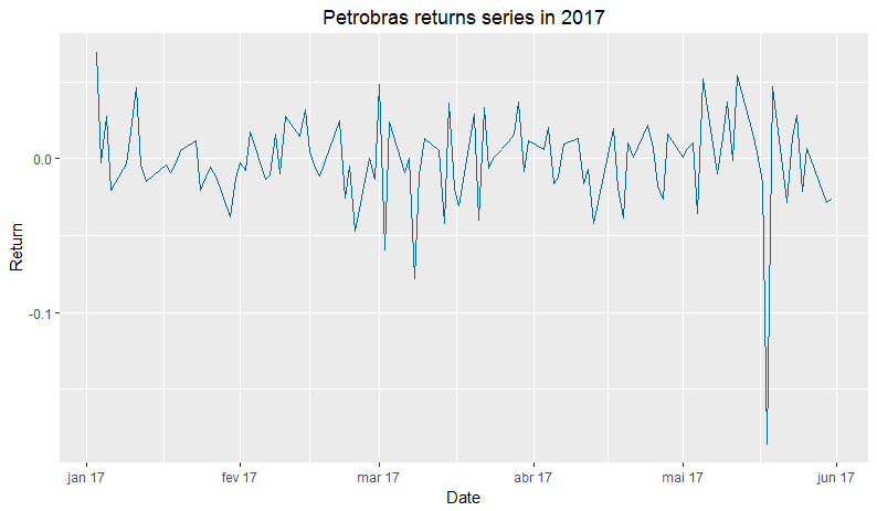
summary(pbr_ret17)

sd(pbr_ret17)
##      Index             PBR.Adjusted
##  Min.   :2017-01-03   Min.   :-0.185241
##  1st Qu.:2017-02-08   1st Qu.:-0.014350
##  Median :2017-03-17   Median :-0.002689
##  Mean   :2017-03-17   Mean   :-0.001707
##  3rd Qu.:2017-04-24   3rd Qu.: 0.014977
##  Max.   :2017-05-31   Max.   : 0.068795

## [1] 0.03089105
We separated in an object all of the returns from 2017, using the function subset(). With this, the descriptive statistics still suggest a negative average return. In other hand, the standard deviation is smaller, which indicates smaller risk. Furthermore, this negative return is given by, in majority, by the big fall in the day 18.
Conclusion
That’s all for this tutorial, folks. In future posts I pretend to do deeper analysis and also approach portfolio and risk theory. I hope you’ve liked!